Traveln.ai · Client project
An AI trip planner that people open even when they are not travelling.
AI trip-planning app. Two engagements: a map that plans trips faster, then a social and rewards layer that brings people back. Booked trips up 20%, trip creation 45% faster.
- Product
- Mobile app · Travel
- Role
- Lead product designer
- Scope
- UX audit, research, UX and UI, design system, validation
- Platform
- AI mobile app, iOS and Android
- Year
- 2024 · Shipped
- Timeline
- Two engagements, a few weeks each
- +20%
- Booked trips and activities
- 45%
- Faster trip creation
- 3×
- Better place recommendations
- 12% → 20%
- Daily active users after the rewards layer
The situation
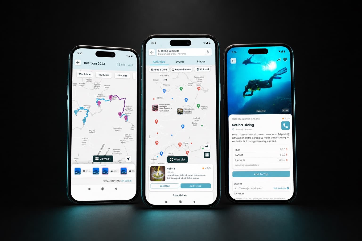
Traveln.ai wanted to be the AI trip planner people reach for first: a journey designed in minutes. The product had two gaps, and we worked on them in sequence. It had no map, so planning happened in lists. And once a trip was booked, people had no reason to come back until their next holiday.
Part one: the map
Planning a trip without a map is navigation without a compass. The early app relied on lists and static cards, with no way to compare places, spot hidden gems or judge whether a route was realistic. People who think visually were left out.
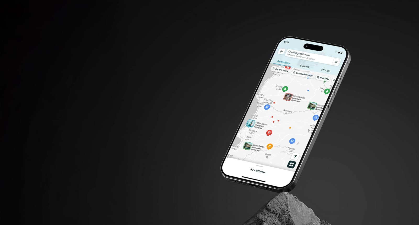
Three things came out of the first sessions with the founders. The experience had to be map first. Discovery had to be balanced with AI personalisation without overwhelming anyone. And faster trip completion was the business goal, because speed means fewer drop-offs and better retention.
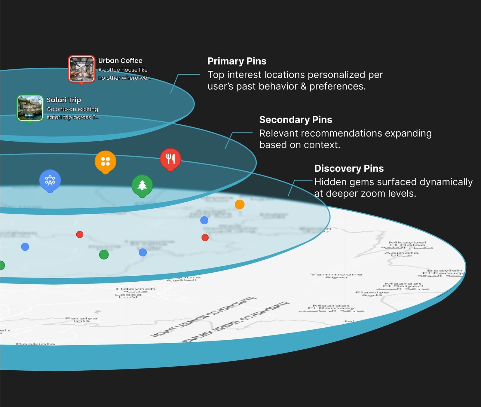
The pin hierarchy
Primary pins.
The places a person is most likely to want, ranked by the AI from their interests and behaviour.
Secondary pins.
Contextual recommendations around the primary ones, so relevance expands without noise.
Discovery pins.
Hidden gems that appear as the map is zoomed in, for people who like to explore.
Sponsored pins.
A revenue model we proposed, not one the client asked for: paid placement that still serves the traveller.
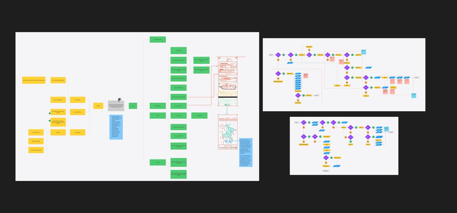
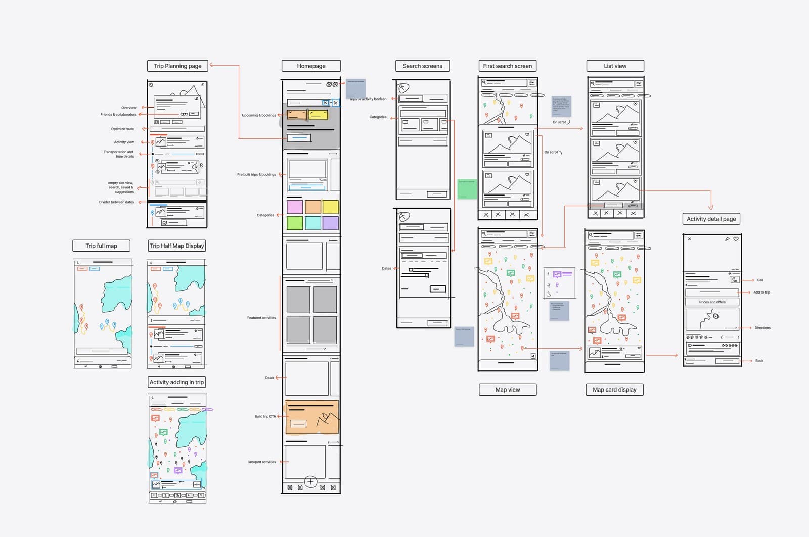
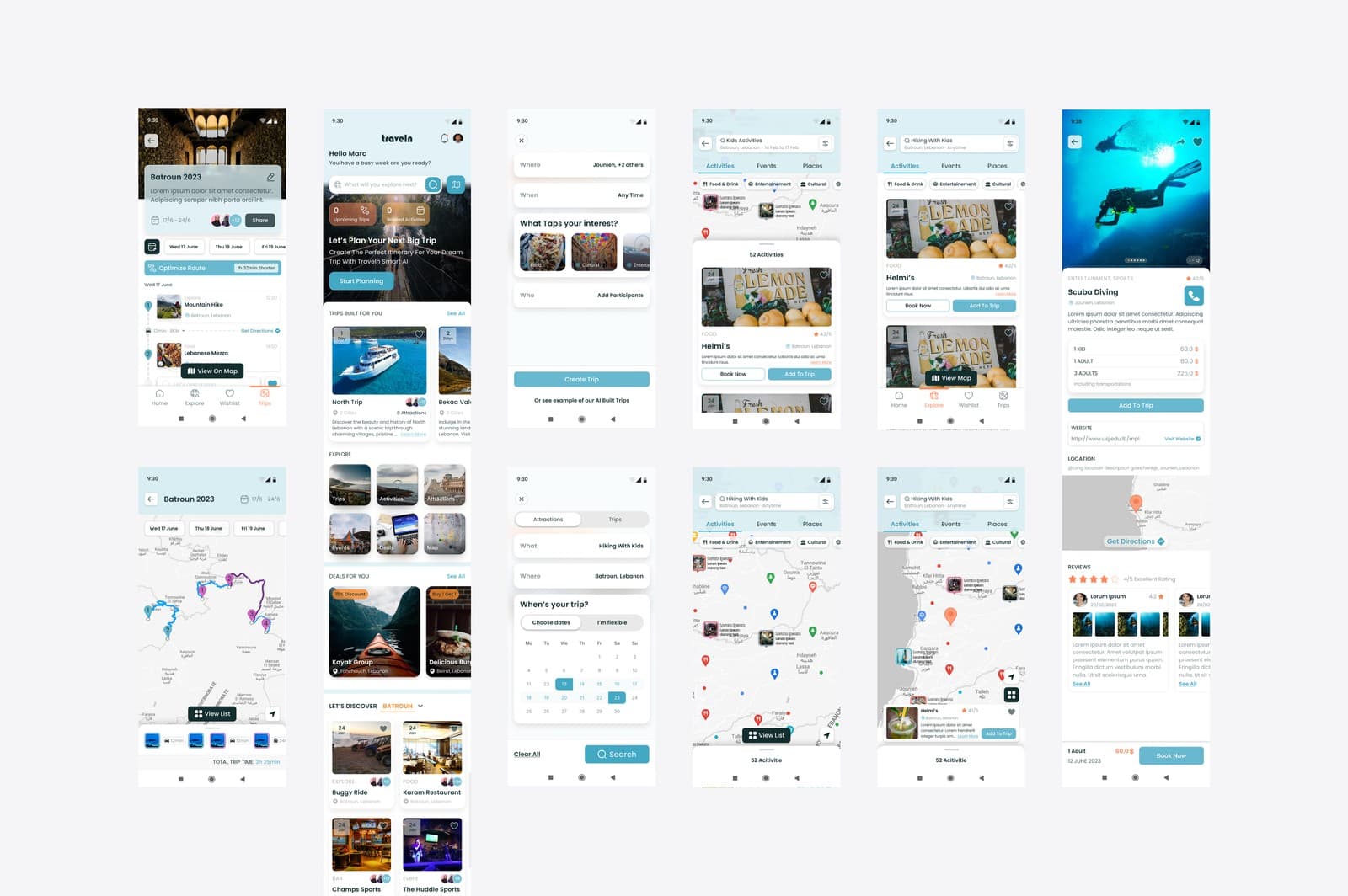
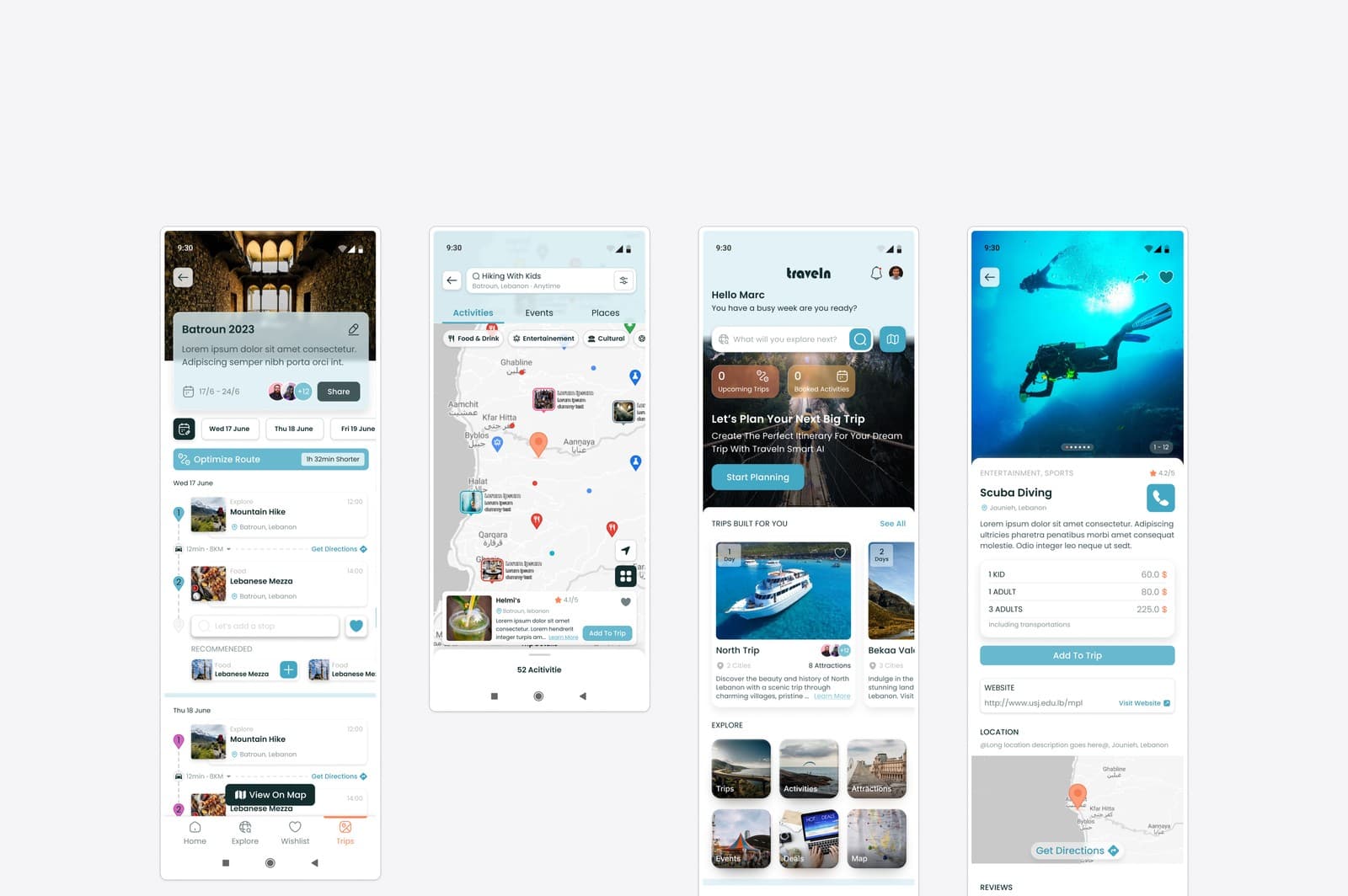
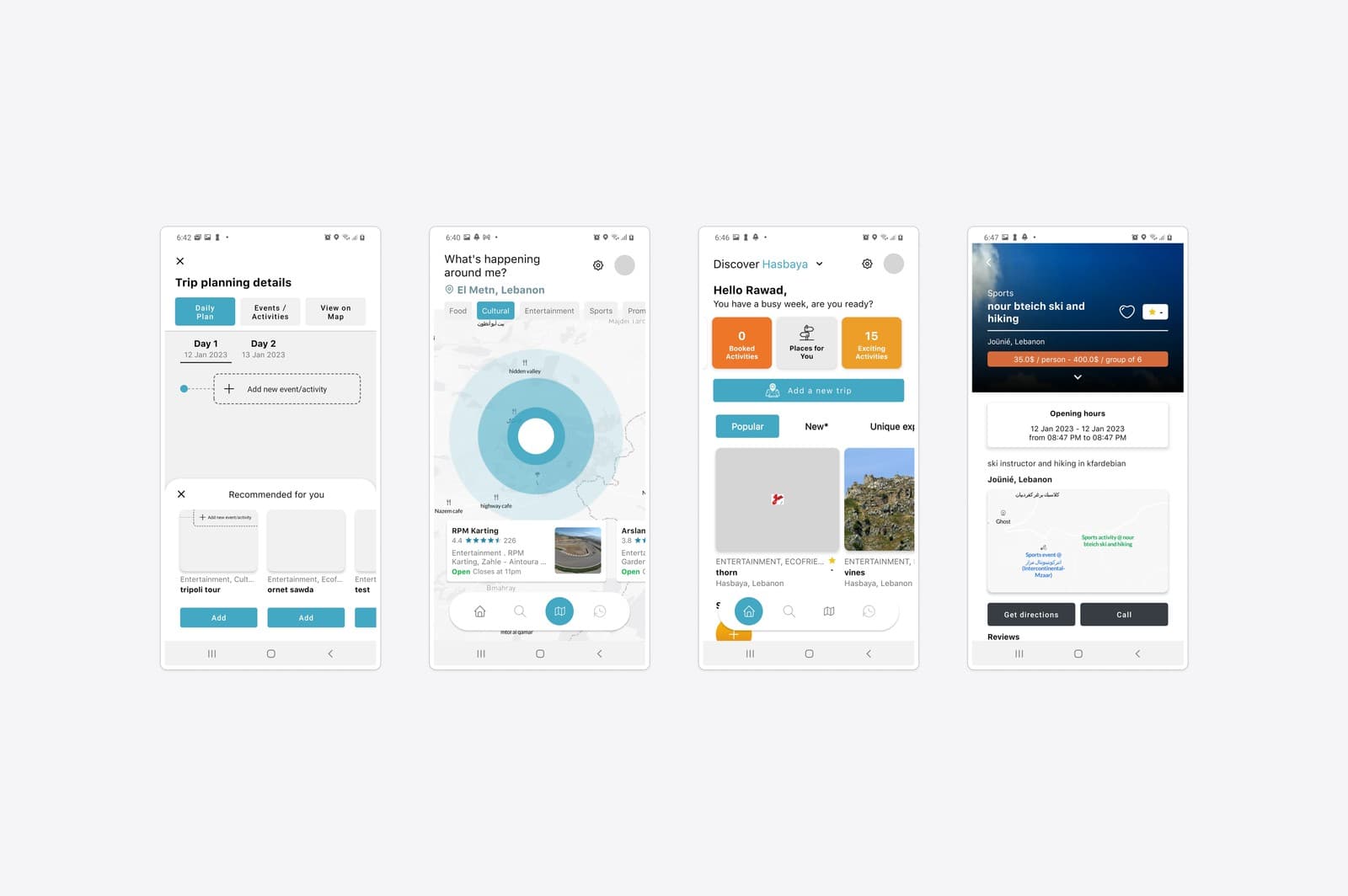
Before and after the map.
The handoff
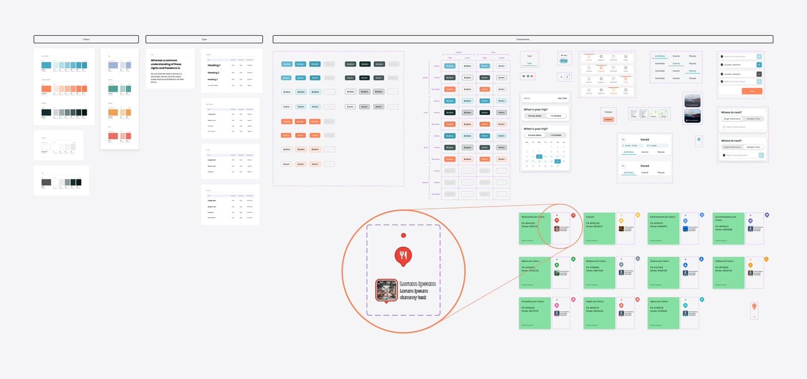
Delivery included a design system: colours, type and reusable components, so the team could scale the product and add revenue features without breaking consistency.
“Before partnering with UX Shine, we were leaning toward hiring in-house designers to build our map feature. In just a few weeks, they designed a map experience that streamlined trip planning and introduced strategic ideas. The speed, depth of insight and polished execution would have taken us months to replicate in-house.”
 Imad AfyouniCEO and co-founder, Traveln.ai
Part two: from planner to habit
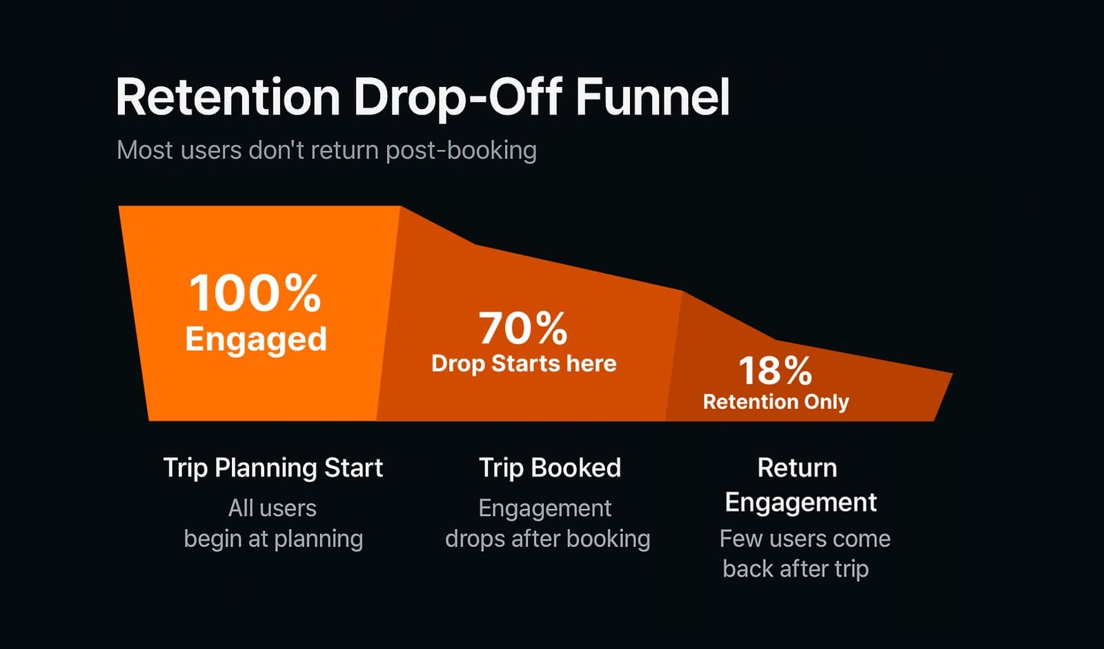
Travel apps lose people between trips. Plan, book, vanish until the next holiday. Even happy customers dropped off after booking, and revenue opportunities went with them.
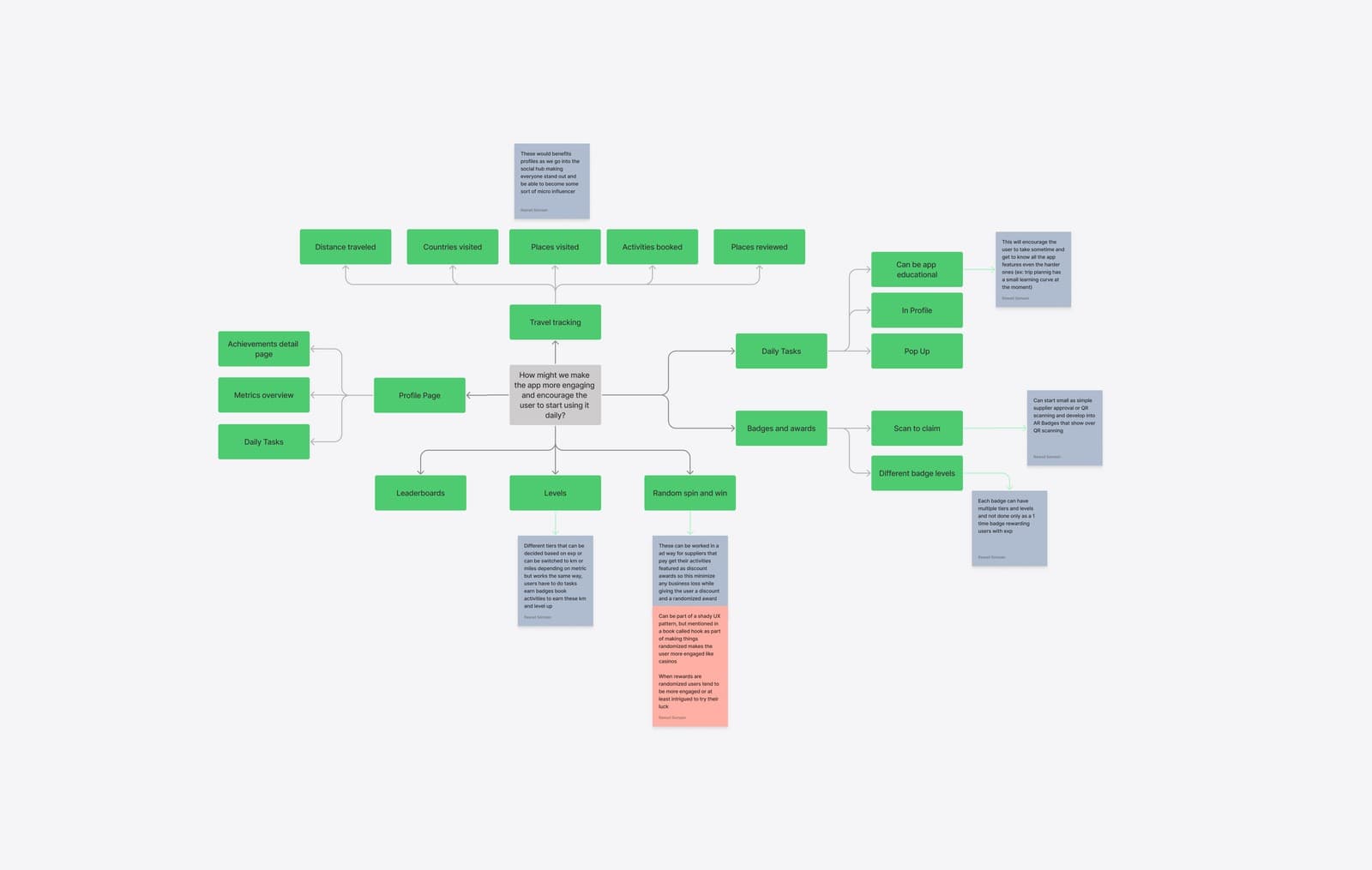
The founders wanted Traveln.ai to feel like Duolingo or Strava: an app people open daily even when they are not buying. We reframed the brief as one question. How might we make people open the app when they are not travelling?
Learning from the best
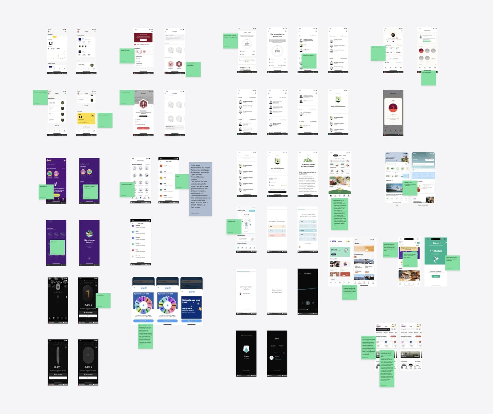
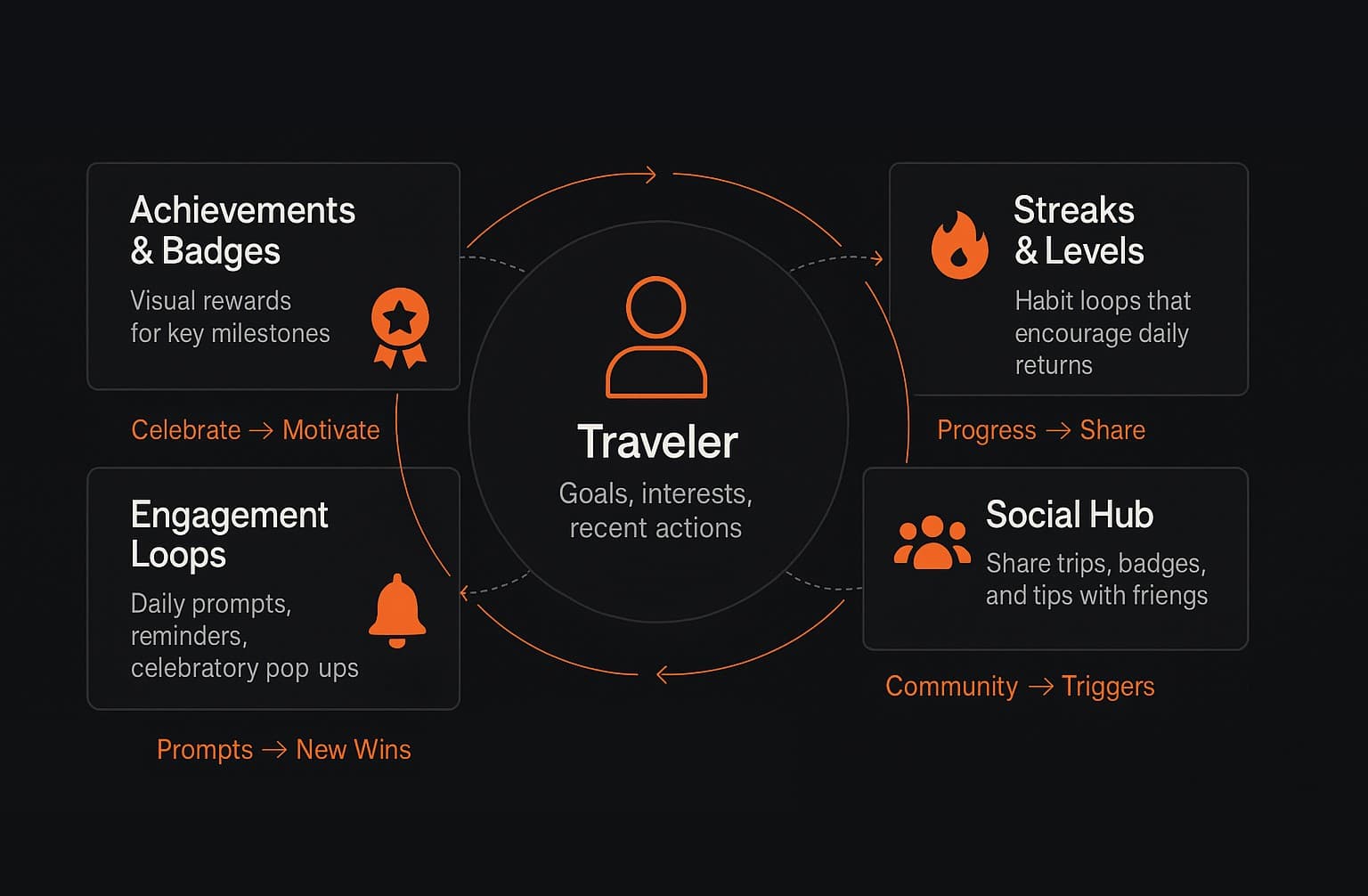
We studied Nike Run Club, Duolingo and Grab, and translated their mechanics into travel rather than copying them: achievements and badges for completed challenges, streaks and levels for daily motivation, a social hub where people share trips and badges, and daily prompts with rewards.
Design and validation
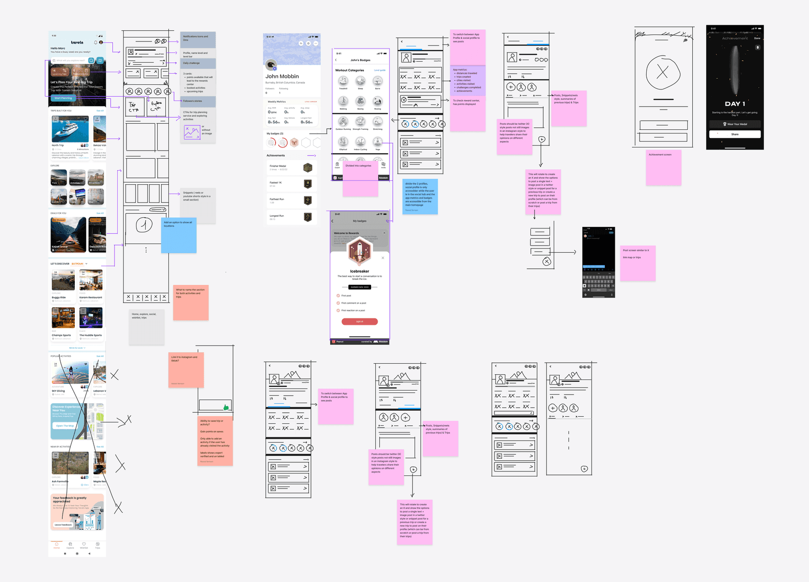
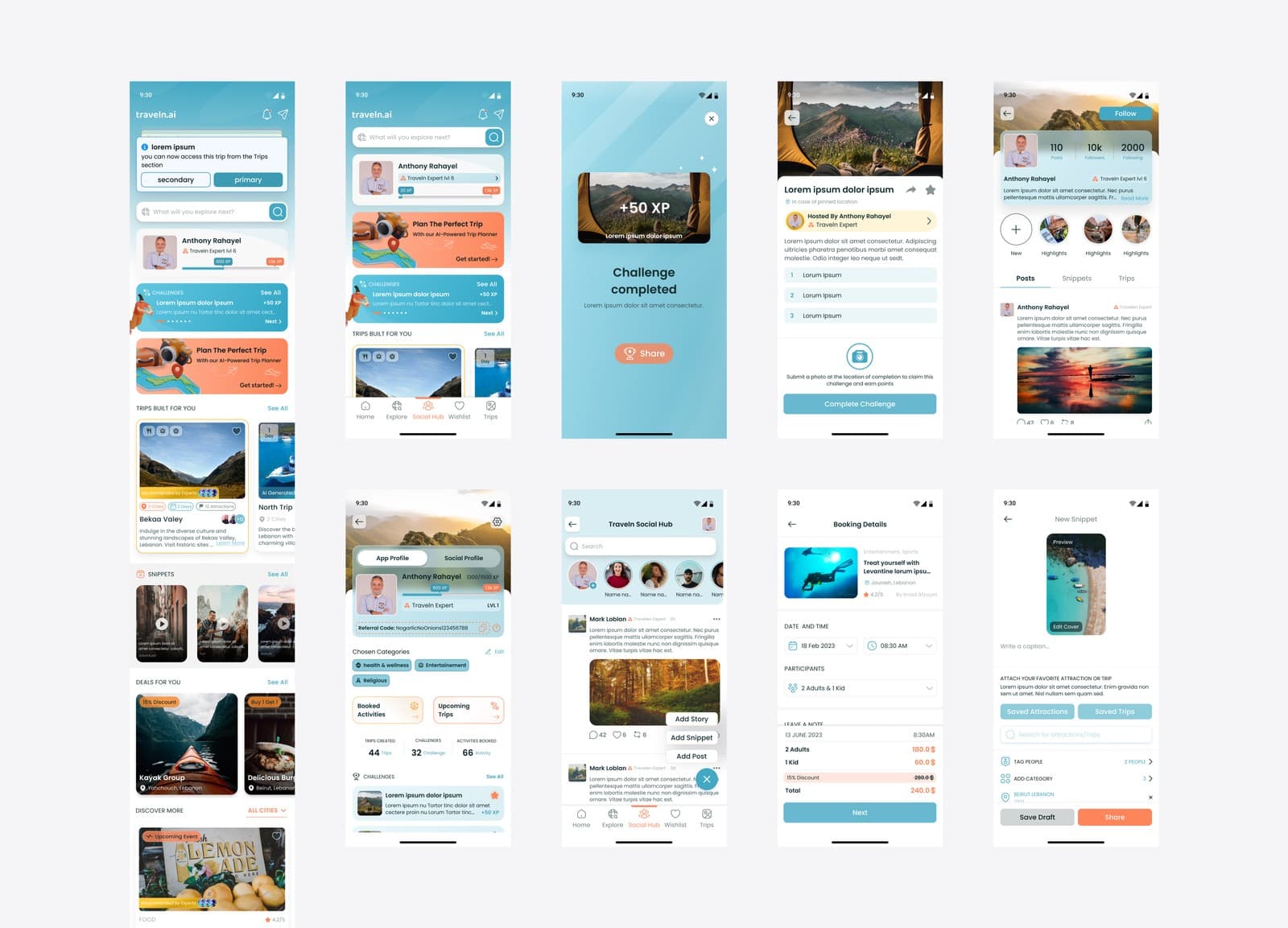
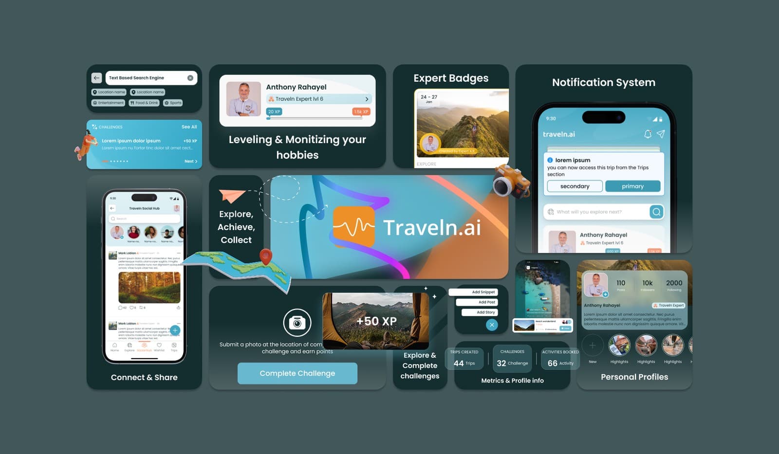
Quick sketches of challenges, streaks and a social feed tested well straight away: people understood the reward mechanics without explanation. The polished interface turned progress into an emotional win, with badges, streak counters, celebratory pop-ups and a community feed for trip highlights.
A prototype tested against a control group showed three times more logins a week, daily active users up from 12% to 20%, and the average session up from 3.5 to 6.2 minutes.
“The gamification prototype instantly showed us what we were missing. UX Shine proved that a design partner can generate more value if you find the right partners.”
Imad AfyouniCEO and co-founder, Traveln.aiThe outcome
Traveln.ai went from a planning tool with a gap to a travel companion: more bookings, faster trip creation, three times the weekly sessions, a design system that scales, and two revenue paths proposed by design rather than requested by the client.
More work
Related case studies
Have a product like this?
We reply by email to set up a call. Most projects start with a short conversation and a scoped proposal.