Mobile app UX best practices we design by
The short answer
Good mobile app UX comes from a short list of practices: one primary action per screen, frequent controls within thumb reach, predictable navigation, short onboarding, forms that ask for less, and clear loading, empty, error and offline states. On top of that come accessibility and, for Arabic users, a correct right-to-left layout. We apply the same list to every app we design, from ride booking to AI trip planning.
Why should each screen have one primary action?
Each screen should have one primary action because people use phones quickly and with partial attention, and one clear next step is faster to find than three competing ones. Secondary actions can exist, but they should look secondary.
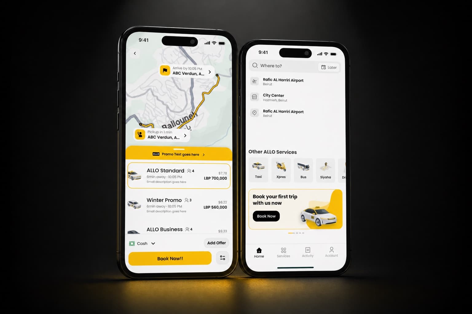
The same idea applies across a whole app. In the Allo Taxi super app, rides, Xpres delivery, Allo Bus and Siyaha tours all follow one booking grammar: select, configure, confirm, track. Each step is one screen with one main action. A person who has booked a ride already knows how to send a parcel, because the steps are the same.
How do you design for thumb reach?
Put the actions people use most in the lower part of the screen, where the thumb reaches without changing grip, and keep rare or destructive actions away from them. In practice:
- Place primary buttons at the bottom of the screen, full width or close to it.
- Use bottom sheets for choices and details instead of new screens at the top.
- Keep top-level navigation in a bottom tab bar.
- Make touch targets at least the minimum sizes in Apple's Human Interface Guidelines and Material Design, including for small icons.
- Leave space between a primary action and a destructive one, such as Pay and Cancel.
Which navigation pattern should a mobile app use?
Most apps should use a bottom tab bar for a few top-level sections, stacked screens for moving deeper, and bottom sheets for short tasks that should not take the person away from where they are. Hidden side menus make sections harder to find, so we use them only for settings and rarely used items.
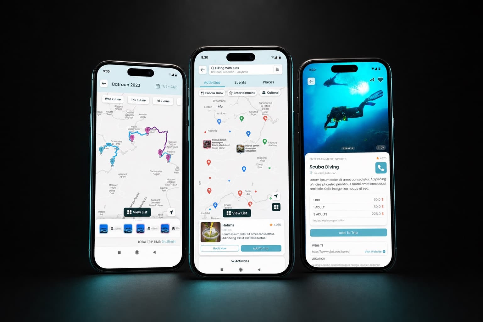
Some apps are built around one main view. The Allo Taxi home is centred on the map, with a single "Where to?" field, because the destination is the first thing the app needs to know. Traveln.ai is map-first too: the trip is planned on the map, and lists and details open over it instead of replacing it.
How should onboarding work in a mobile app?
Onboarding should get people to the first useful action as fast as possible, and ask for an account, permissions and preferences only at the moment they are needed.
- Let people look around before they sign up, when the product allows it.
- Ask for location access when the person first uses a feature that needs it, and explain why in one sentence.
- Use phone number and one-time code sign-in where that is what your users expect.
- Replace tutorial carousels with hints inside the real screens.
How do you design forms and input on mobile?
Ask for fewer fields, and make each field easy to fill with the right keyboard, sensible defaults and clear errors. Every field you remove is one less reason to stop.
- Show the numeric keyboard for numbers and the email keyboard for email addresses.
- Prefill what you already know, such as the current location or the last payment method.
- Keep labels visible above fields. Placeholder text disappears as soon as someone types.
- Validate as people finish a field, and say what to fix in plain words.
- Offer the payment methods your users actually use. In Allo Taxi, cash is the first option, with cards alongside it, because most riders in Lebanon pay cash.
How should an app handle loading, empty and error states?
Every screen needs a designed state for loading, for having no content yet and for failing, because these are the moments when people decide whether to trust the app.
- Loading: show the layout right away with placeholders, and show progress for anything that takes longer than a moment, such as finding a driver.
- Empty: explain what will appear here and give one action to get started, such as "Plan your first trip".
- Error: say what happened, keep what the person already entered, and offer a way to retry.
How do you design for offline use and slow networks?
Design the app to keep working with what it already has, and be honest about what is out of date. Mobile networks drop in lifts, tunnels and on the road, and a blank screen with a spinner is the worst response.
- Cache the last known data, such as a booking or an itinerary, and show it offline.
- Label stale data with the time it was last updated.
- Queue actions that can wait and send them when the connection returns.
- Keep images light and load them after the text, so the screen is usable first.
When should an app send notifications?
An app should send a notification only when something happened that the person needs to know or act on, such as a driver arriving, a delivery status changing or a booking being confirmed. Promotions belong in the app, not the lock screen. Ask for notification permission after people have seen the value, not on first launch, and give them separate controls for each type.
What does accessibility mean for a mobile app?
An accessible mobile app works with the system text size, the screen reader and enough colour contrast, and never relies on colour alone to carry meaning. We check that layouts still work at large text sizes, that every icon button has a label for VoiceOver and TalkBack, that contrast meets WCAG, and that states like selected or failed are shown with text or shape as well as colour.
How do you design a mobile app for Arabic and right-to-left?
Design the Arabic version as a mirrored layout from the start, not as a translation added at the end. The whole interface flips: navigation, back arrows, progress, sliders and the order of items in a row. Some things do not flip, such as media playback controls, phone numbers and maps. Arabic text also needs a typeface designed for it, with line heights that fit its letterforms. We build both directions from one component library, which is what our Arabic and RTL design work is based on.
How do you know a mobile app's UX works?
You know by watching real users complete real tasks on the prototype before launch, and by measuring after it. We run usability tests in Maze on the main flows, fix what people struggle with, and then track completion and drop-off in the live app. If you are planning an app, our mobile app design work follows exactly this list.
Related services