Allo Taxi · Client project
One app for rides, deliveries, buses and tours.
Super app for a Lebanese taxi brand: ride hailing, package delivery, scheduled buses and tours in one product, with one booking grammar across all four.
- Product
- Mobile app · Mobility
- Role
- Lead product designer, with Smartr Code
- Scope
- UX flows, high-fidelity UI, design system, developer-ready specifications
- Platform
- Consumer mobile app, iOS and Android
- Year
- 2026 · In development
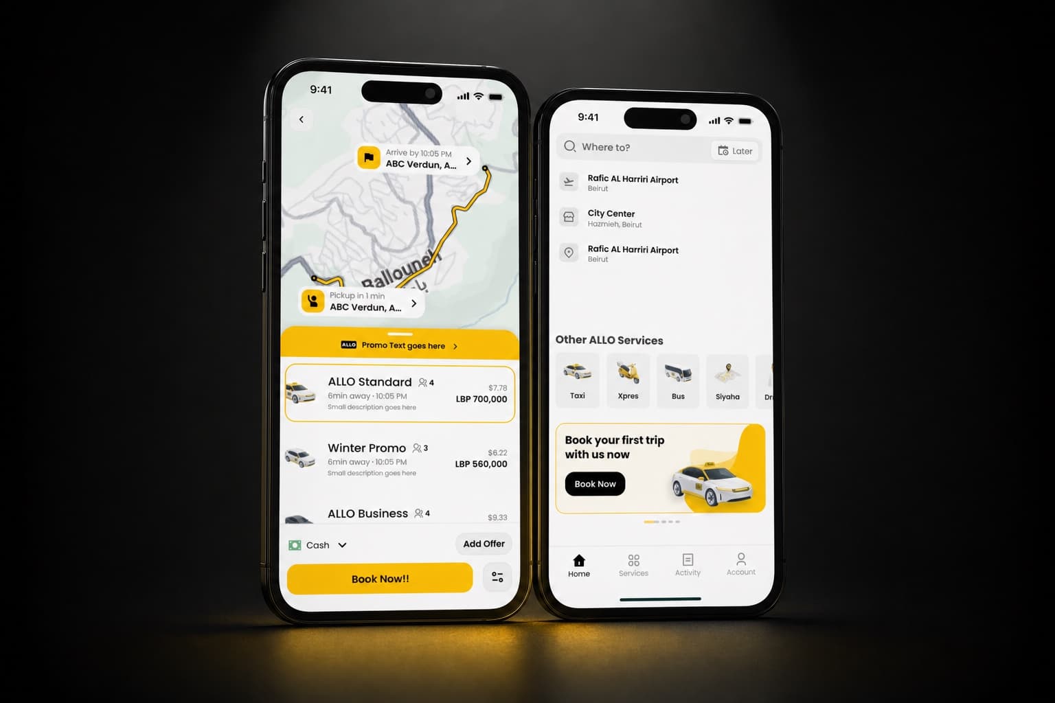
The situation
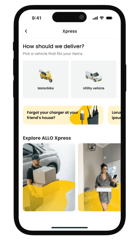
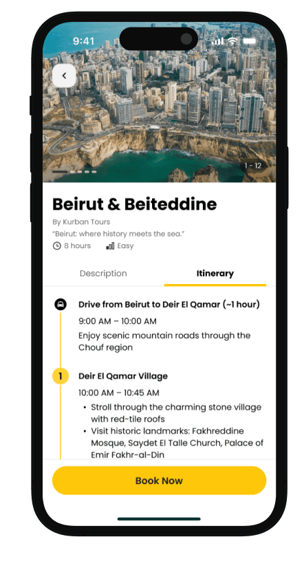
Allo Taxi is a household taxi brand in Lebanon. It set out to become one platform for mobility and services: taxi ride hailing, package delivery (Xpres), scheduled transport (Allo Bus) and tours and experiences (Siyaha). The ambition is to operate in the league of Uber, Bolt and Careem while offering a wider set of services.
The problem
Super apps fail in a predictable way. Each added service multiplies complexity until nothing is easy any more. The challenge was to make four very different services feel like one product, where a person who has booked a taxi already knows how to send a package or book a tour. That meant simple service discovery, less friction in booking, consistency across services, live tracking, and room for future services without a redesign.
Research on four tracks
User personas.
Grounded in the demographics and pain points of Allo's actual rider segments.
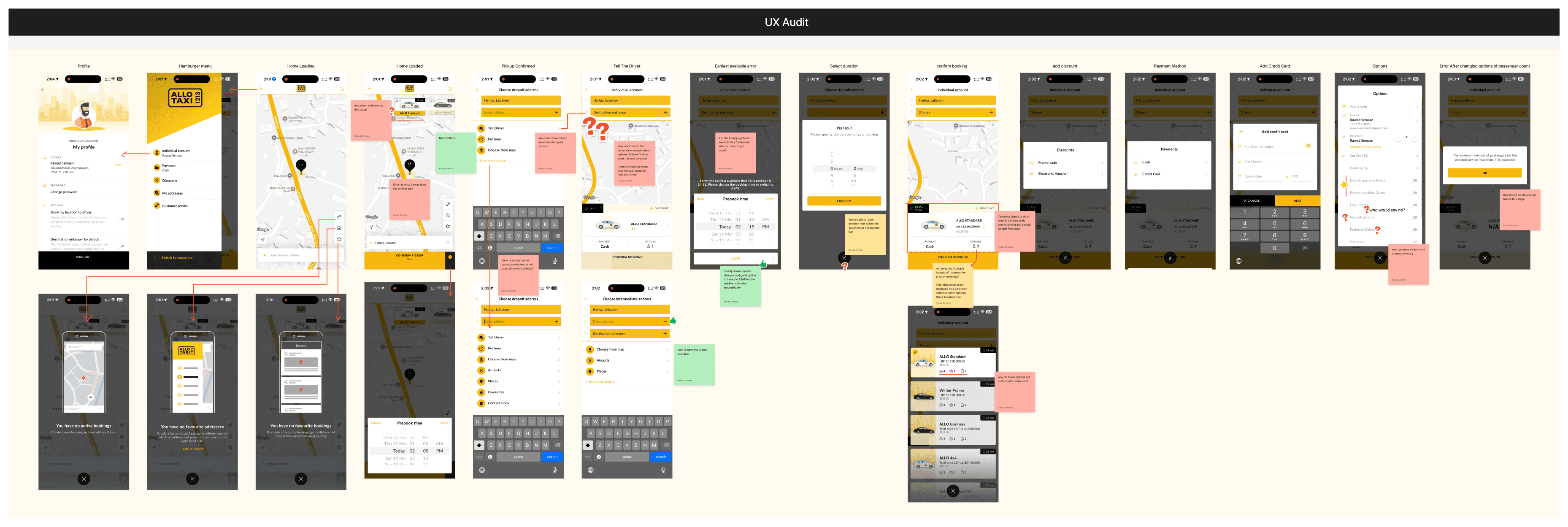
A UX audit of the existing app.
Every screen annotated. Friction points, dead ends and inconsistencies mapped before proposing anything new.
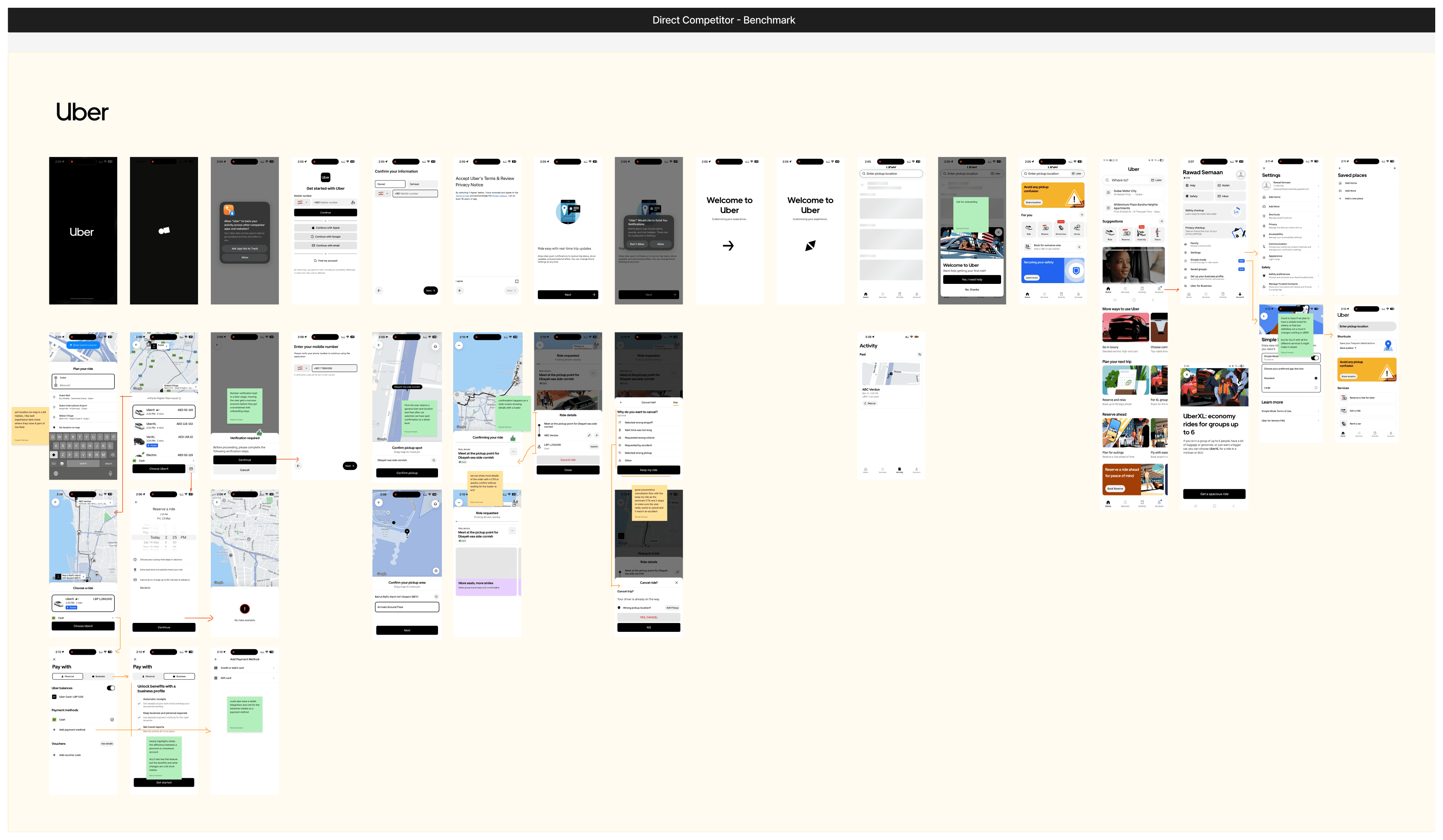
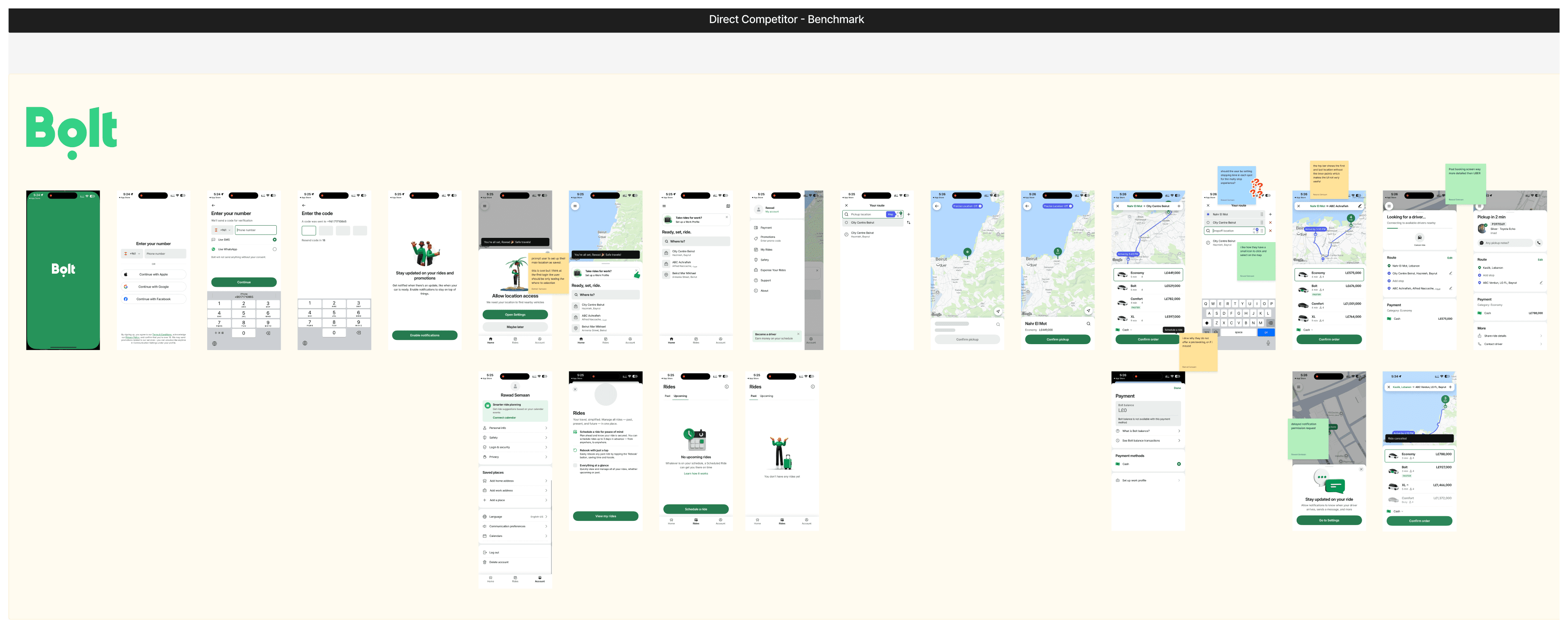
Competitor benchmark: Uber, Bolt and Careem.
Full booking flows recorded and dissected screen by screen. What each does well, such as Uber's handling of cognitive load and Bolt's inline city selection, and where Allo could differ.
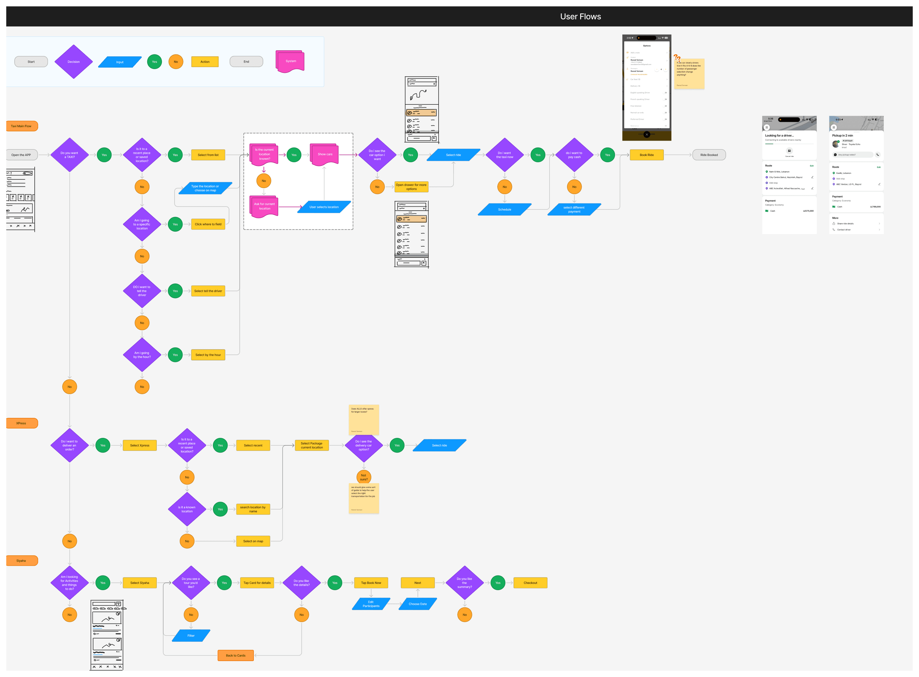
User flows.
Every service's journey drafted and pressure-tested before wireframing.

Key decisions
A map-centred home as the service launcher.
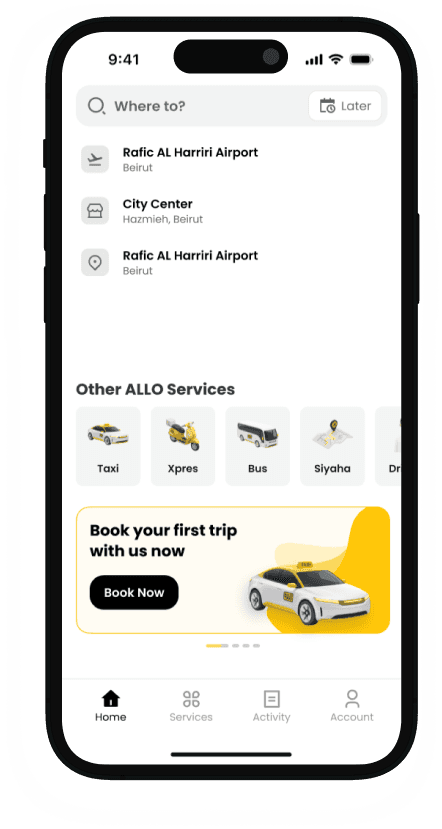
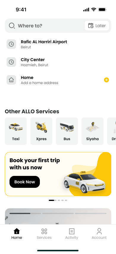
Instead of the grid of icons every super app reaches for, the home screen is the map with a 'Where to?' entry, the taxi mental model people already have, with the other services one tap away. Two home structures are being A/B tested with real users: services as top tabs, or a services section inside the home. The data decides.
One booking grammar across all services.
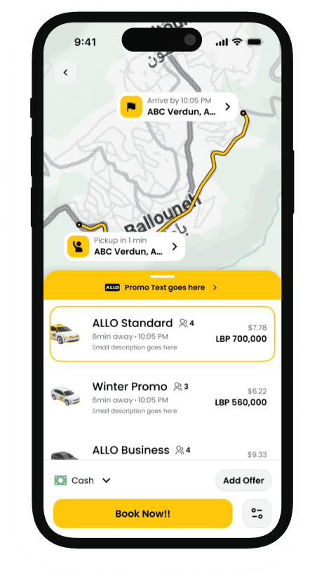
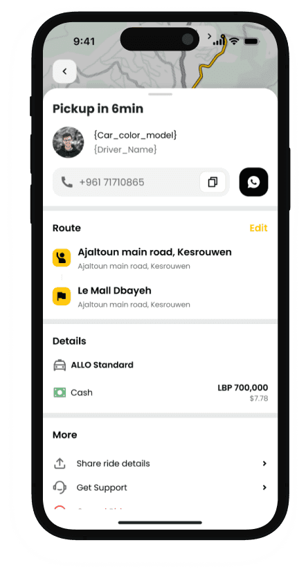
Rides, Xpres delivery, Allo Bus and Siyaha tours follow the same structure: select, configure, confirm, track. Consistency does the teaching. Learn one service and you know them all.
Scale planned in, not bolted on.
About 60 to 80 screens across the modules, on one design system with developer-ready specifications. Chauffeur and roadside assistance are already scoped for later phases and plug into the existing patterns.
Both wallets in mind.
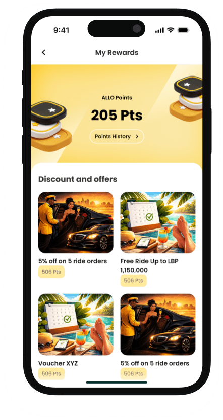
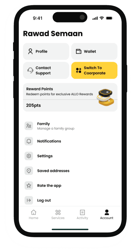
Cash-first market realities, with pricing in Lebanese pounds and cash as the default, alongside cards, corporate accounts with a one-tap personal and corporate switch, and a rewards programme that drives use across services.
Where it stands
The app is in development. Design was delivered as one system: about 60 to 80 screens across the four services, reusable components and developer-ready specifications. The home structure test is running, and launch numbers follow the release.
More work
Related case studies
Have a product like this?
We reply by email to set up a call. Most projects start with a short conversation and a scoped proposal.