Accessible UX design: a practical guide to WCAG 2.2
The short answer
Accessible UX design means building products that people can use regardless of vision, hearing, movement, cognition or language. In practice it means meeting WCAG 2.2 for contrast, focus, keyboard access, labels, touch targets, motion and text resizing, building those rules into the design system, and testing with real assistive technology.
What is accessible UX design?
Accessible UX design is designing a product so that people with different abilities, devices and languages can use it without help. It covers people who are blind or have low vision, people who cannot use a mouse, people with tremors or limited movement, people who are sensitive to motion, and people who read in a different language or direction. It also helps everyone else: someone using a phone in sunlight, with one hand or on a slow connection.
The standard most teams work to is the Web Content Accessibility Guidelines 2.2 from the W3C. Level AA is the usual target for commercial products, and it applies to apps and SaaS platforms as much as to websites.
Which WCAG 2.2 requirements matter most in product design?
The requirements that affect design decisions most are contrast, visible focus, keyboard access, labels, touch target size, motion and text resizing. Each one is a concrete check a designer can make on a screen.
- Contrast. Body text needs a contrast ratio of at least 4.5:1 against its background, and large text at least 3:1. Icons, input borders and focus indicators need at least 3:1.
- Focus states. Every interactive element needs a visible focus indicator, and WCAG 2.2 adds that the focused element must not be fully hidden by sticky headers, footers or panels.
- Keyboard access. Everything that works with a mouse or touch must work with a keyboard alone, in a logical order, with no traps.
- Labels. Every input has a visible label, and every icon button has an accessible name. The visible text of a control should be part of its accessible name.
- Touch targets. WCAG 2.2 sets a minimum target size of 24 by 24 CSS pixels, or enough spacing around smaller targets. We design to larger sizes on mobile.
- Dragging. Any action done by dragging, such as reordering or sliders, also needs a single-tap or click alternative.
- Motion. Nothing should flash more than three times a second, moving content needs a way to pause, and animations should respect the system reduce-motion setting.
- Text resizing. Text must stay readable and usable at 200% size, and content must reflow at narrow widths without horizontal scrolling.
- Screen readers. Headings, landmarks, lists and tables must be real structure, not just visual styling, and status messages must be announced.
WCAG 2.2 also adds requirements that affect flows rather than single screens: do not ask people to re-enter information they already gave, put help in the same place on every screen, and do not rely on memory or puzzle tests to sign in.
Why build accessibility into the design system instead of auditing at the end?
Building accessibility into the design system means every screen starts accessible, while an audit at the end finds the same problems many times over and turns them into late, expensive fixes. If the button component has a correct focus state and the colour tokens pass contrast, every screen that uses them inherits that.
- Colour tokens are defined in pairs, text on background, with the contrast checked once in the system.
- Components ship with every state designed: default, hover, focus, active, disabled, error and loading.
- Focus styles are a token of their own, visible on every background the product uses.
- Spacing and size tokens enforce minimum target sizes for buttons, icons and list rows.
- Type scales are tested at larger system text sizes so layouts do not break.
- Motion tokens include a reduced-motion variant for each animation.
- Documentation for each component states its keyboard behaviour and accessible name.
This is a core part of our dynamic design systems work. Accessibility rules live in the tokens and components, so a new screen cannot easily break them.
How do you design accessibly for Arabic and right-to-left readers?
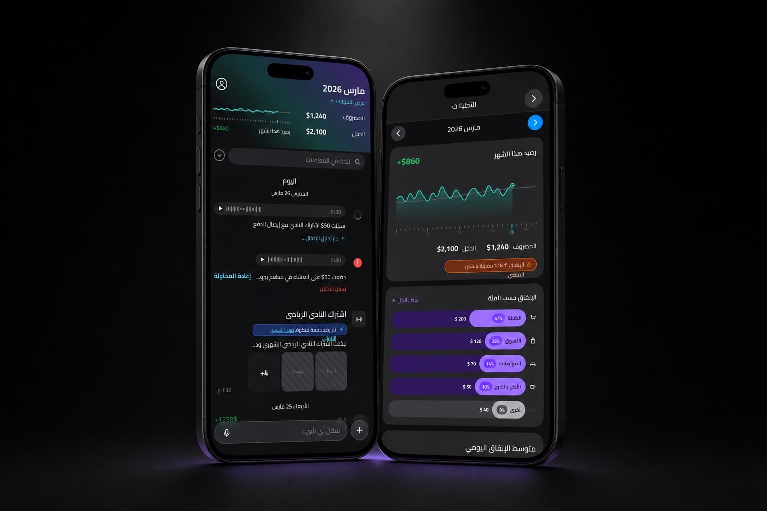
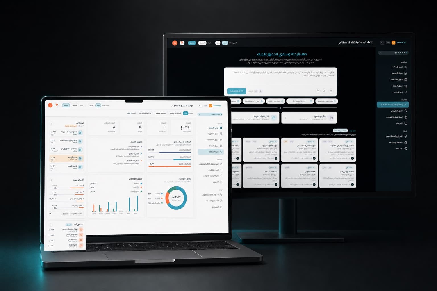
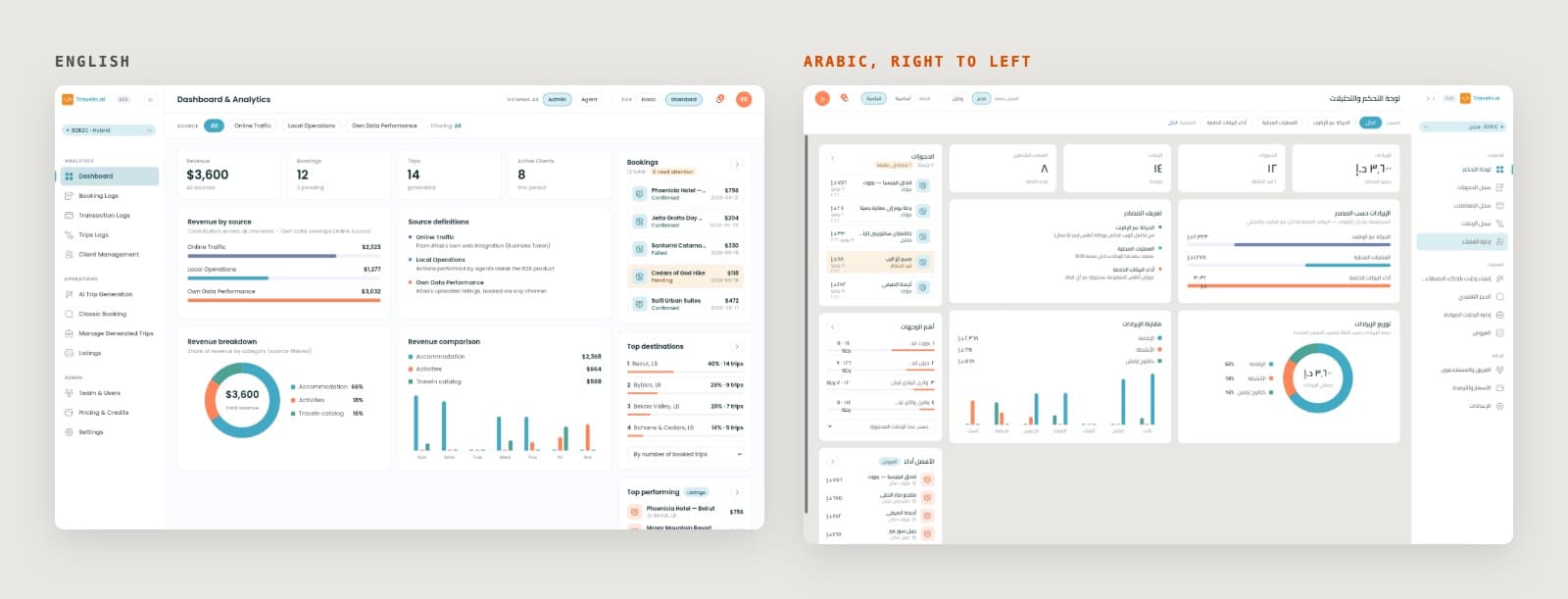
Designing for Arabic readers means mirroring the layout for right-to-left reading while keeping the parts that should stay left to right, and handling numerals and mixed-direction text on purpose. A product that is only translated, not mirrored, is hard to read and easy to misuse.
- Mirroring. Navigation, reading order, back and forward arrows, progress steps and alignment all flip. Icons that show direction flip too, while icons of real objects, such as a clock or a play button, usually do not.
- Numerals. Decide per product whether figures use Latin or Eastern Arabic numerals, and apply the rule consistently. Codes, references and amounts that people copy or compare often read best in Latin numerals.
- Mixed-direction text. Arabic sentences that contain English names, product codes, emails or amounts need correct bidirectional handling so words and punctuation do not jump to the wrong position.
- Charts and time. Decide whether time axes mirror. Many Arabic readers expect financial and time series charts to keep a left-to-right time axis.
- Type. Arabic script needs a font designed for it, with larger sizes and line heights than Latin text at the same visual weight.
- Screen readers. Set the correct language on the page and on mixed-language fragments so assistive technology pronounces them correctly.
Both choices come from how each product's users read and compare numbers. We cover this in our Arabic and RTL design work.
How do you test a product for accessibility?
Test accessibility with a mix of automated checks, manual checks and people who use assistive technology. Automated tools catch a share of issues such as missing labels and low contrast, but they cannot judge whether a flow makes sense to someone using a screen reader.
- Check contrast and target sizes in design files before handoff.
- Run automated checks on built screens as part of development.
- Go through each key flow using only the keyboard.
- Go through each key flow with VoiceOver on iOS and macOS and TalkBack on Android.
- Increase system text size and turn on reduce motion, then check every screen again.
- Test the Arabic version with native Arabic readers, not only by switching the language.
- Include people with disabilities in usability testing for the flows that matter most.
Related services