AI chat correction UX: how do you let users correct a wrong answer?

The short answer
AI chat correction UX means designing the single screen where a user recognises an answer is wrong and decides to trust, fix or abandon it. Treat that screen as an interface state: show the answer, its provenance and confidence, surface lightweight verification controls, and make every edit produce an audited delta that can feed retraining.
AI chat correction UX: what is the exact moment you must design for?
The moment is the screen where a user recognises an answer is wrong and decides whether to trust it, fix it, or abandon it. Design that screen as a deliberate interface state so the user need not hunt for controls when they decide to act. The interface must show the answer, where it came from, how confident the system is, and the primary affordances to check or edit, all at once. ACM IUI 2015 found that explanatory debugging that exposes reasoning and lets people edit feature relevance increased participants’ understanding by 52% and allowed corrections up to twice as efficiently, so prioritise editable explanations rather than burying them behind menus (ACM, 2015).
Picture a user on a phone. The chat bubble reads like a fact. The user frowns, taps it, and the moment becomes a decision: trust, correct, or walk away. If the UI leaves this as an afterthought the user usually walks away. Put verification controls up front and make the state recognisable: an answer area, a row of source pills, a confidence indicator, and a compact control bar with the most common actions. That single screen is the point where correction either happens or fails.
How should the UI show provenance and why?
Show provenance as structured, tappable items, not a single 'source' line. A source pill should present the agent name, type such as document or dataset, a short excerpt that contains the cited claim, and a link to an expanded provenance panel. That makes it fast to judge relevance without leaving the failed state.
The expanded panel should follow W3C PROV concepts such as entity, activity and agent so records are interoperable with auditing tools and can be machine-read later. W3C PROV defines the data model and terms you need to capture provenance consistently (W3C, 2013). Record each provenance entry as a discrete object a UI can open, a logger can attach to the query, and an auditor can replay.
Include model version and pipeline steps in the panel and link to a model card or dataset datasheet so operators and auditors can judge scope and caveats. Model Cards and Datasheets offer the structure to document intended use, evaluation and dataset provenance for downstream users and auditors (Mitchell et al., 2019; Gebru et al., 2018). Treat provenance as first class data: surface it to the user and persist it as PROV-aligned records engineers can query.
How should the interface display and act on uncertainty?
Display uncertainty so users can decide whether to verify or accept an answer. Use categorical confidence bands such as High, Medium and Low plus N-best alternatives or highlighted uncertain fragments instead of raw percentages unless you usability-test numeric formats, following Google PAIR guidance. Categorical bands are quicker to read and easier to tie to behaviour such as surfacing edit controls when confidence is not High.
When confidence is Low surface verify-and-edit affordances and a short explainer of why the model is uncertain. Nielsen Norman Group recommends inline source previews and click-to-ask-about-a-fragment to encourage verification rather than hiding uncertainty (Nielsen Norman Group, 2025). Make the uncertain fragments tappable so users can ask 'why here' and get the supporting evidence without guessing.
Which fields should be editable and how should edits flow?
Editable fields must map to structured system inputs so edits are actionable, not cosmetic. Expose the parsed facts, source snippets and prompt or constraint fields that feed your pipeline instead of letting users rewrite the whole output as a free text blob. This ensures an edit can be applied immediately and replayed later for retraining.
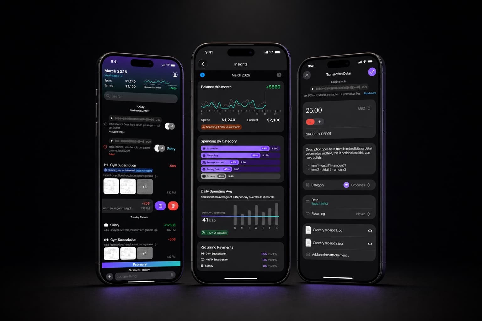
Use your product constraints to decide which fields to surface. Ejjati keeps the original note and parsed expense fields, so expose both: show the raw note, the parsed category, amount and merchant as editable fields, and add an explicit 'save parsed values' action so the corrected parse is applied to the ledger. In ArchViz Studio renders use an ID map so edits must be segment-level; expose a per-segment material editor rather than a free-text change box. Those constraints change the UI because an edit must map to the renderer or pipeline input.
Every edit should produce a delta record that becomes the unit of audit and retraining signal. Capture original value, edited value, user id, timestamp and a short reason. Store those deltas separately from raw user content so they can be reviewed, aggregated and fed into monitoring workflows without violating privacy or mixing raw inputs with curated corrections.
What exact controls should the UI provide and when should each surface?
Design a small set of repeatable controls and rules for when the model may render them. Surface lightweight checks always. Surface heavier controls only when confidence is Medium or Low or when the user asks for more detail. Keep controls consistent so users can act without relearning the interface.
- Source pill to expand provenance and jump to the excerpt.
- Highlight-to-verify on uncertain fragments that opens a mini-evidence view.
- Inline edit on structured fields that maps to system inputs and saves a delta.
- Propose-alternative that opens a side editor for larger edits or re-prompts.
- Accept and reject with a short undo window so users can recover from mistakes.
- Flag-for-retrain to tag edits as high-signal, harmful or recurring.
- Human-handoff for cases where confidence is low and the cost of error is high.
Surface heavier controls such as propose-alternative or flag-for-retrain when confidence is Medium or Low, or when the user opens the provenance panel or taps the explain button. For streaming output include a cancel and a 'pin current' control so users can stop streaming but keep the current text for editing. Encode these controls and the display rules in a dynamic design system so the runtime assembler can show the right state based on confidence, user intent and component availability. See our dynamic design systems service for how to hand those rules to engineers our dynamic design systems.
What logs and handover data do engineers need to act on corrections?
Give engineers a PROV-style record for every answered query that includes the original input, normalized inputs, model version, pipeline calls, confidence and provenance entries. Add the UI action timeline, the edit delta, user id and timestamps so engineers can replay what the user saw and did. That record is the minimum unit for triage, monitoring and audits.
NIST AI RMF 2023 recommends capturing user feedback, appeals and overrides as part of monitoring so these signals can feed retraining, recalibration or decommissioning decisions, so include fields for feedback type, review status and validation outcome in your logs (NIST, 2023). Store edits and their validation state separately from raw user data to support audit, review and privacy policies and to make it easy to surface high-signal corrections for engineering review.
How do you prototype and test correction flows with users?
Prototype the correction flow as a task where the system intentionally provides a plausible wrong answer and measure whether people find and apply the right edit and how long it takes. Make the scenario concrete: a user corrects an expense parse, or swaps a material on a render segment. That keeps the test focused on the interaction, not on abstract trust.
Use Wizard-of-Oz to simulate retrain and human-handoff steps so you can test the entire workflow without a production pipeline. A/B test confidence formats, highlight styles and provenance presentations. Use the ACM IUI 2015 explanatory editing benchmark as a reference point: explanatory debugging can make corrections up to twice as efficient, so aim for measurable improvements in correction time or success rate when you add editable explanations (ACM, 2015). Test with your product constraints: in ArchViz Studio emulate segment-level edits; in Ejjati include the original note so participants can compare and correct parsing errors.
What do founders ask about AI chat correction UX?
- Which corrections should feed immediate model retraining? Send only reviewed, validated and high-signal edits to automated retraining. Use a human validation step and tag edits by confidence, frequency and harm-risk so retrain triggers are rule-based rather than time-based. Capture validation outcome in the log for engineering to inspect (NIST, 2023).
- How do we avoid overfitting to user fixes? Keep a validation holdout set, record model versions and accept retrain triggers only when edits meet thresholds for volume and diversity. Record deltas and reasons so you can audit what the model learned before promotion.
- How much UI friction is acceptable? Measure correction efficiency. Friction that reduces wrong answers or leads to more accurate edits can be acceptable. Friction that prevents users from correcting is not. Use A/B tests and time-to-correct metrics to decide.
- When should you hand the conversation to a human? Hand off when confidence is low and the cost of error is high. Design the handoff as a visible option in the failure state, log the reason and the handoff outcome, and treat handoffs as monitoring signals for model limits.
If you want help designing these components and the runtime rules we can document a dynamic design system your engineers can use to build the correction states and the audit logs. See our AI product design and dynamic design systems services our AI product design our dynamic design systems.

Sources