How to build a design system, implement it and keep it alive
The short answer
To build a design system, audit what already exists, define design tokens, build components from those tokens, document patterns and usage, and ship it in code together with the engineers. Then give it an owner, a version number and rules for contribution and deprecation, or it will drift. AI products and bilingual products need more: states for model output, and layouts that work in both directions.
What is a design system?
A design system is the shared set of tokens, components, patterns and rules that a product is built from, kept in sync between the design files and the code. It is not a style guide PDF or a Figma page of buttons. It is working material that designers and engineers both use, so the same decision is made once and reused everywhere.
Every project we deliver includes one: a reusable atomic design system library, handed over as a structured Figma file with tokens and components.
How do you start building a design system?
Start with an audit of what the product already has. Collect every screen, then group what you find: every button style, every text size, every colour, every table and every form field. Most products turn out to have several versions of the same thing, made at different times by different people.
The audit gives you two things. It shows which variations are real needs and which are accidents, and it gives you the list of components to build first, ordered by how often they appear.
What are design tokens and which ones do you need?
Design tokens are named values for the basic decisions in an interface: colour, type, spacing, radius, shadow and motion. Components use tokens instead of raw values, so a change to a token changes every component that uses it. A complete set usually covers:
- Colour: a base palette, then semantic tokens such as surface, text, border, success and danger.
- Type: font families, sizes, weights and line heights, including numeric styles for data.
- Spacing: one scale based on a single unit.
- Radius, borders and shadows.
- Motion: durations and easing curves for each kind of movement.
Name semantic tokens by purpose, such as color-text-muted, not by value, such as grey-500. Purpose names survive a rebrand and a dark mode.
How do you build components and patterns?
Build components from the tokens up, smallest first: inputs, buttons and labels, then cards, rows and dialogs, then full patterns such as a filterable table or a checkout step. Each component needs all its states designed, including hover, focus, disabled, loading, error and empty, not only the default.
Patterns are where a system saves the most work. A pattern is an agreed answer to a recurring problem, like how a data table filters, sorts, paginates and handles bulk actions. When one pattern is used everywhere, people learn it once.
What should design system documentation include?
Documentation should say when to use each component, when not to, and how it behaves, with examples from the real product. Short, specific rules help more than long principles. For each component we document its purpose, its variants and states, the tokens it uses, content guidelines such as label length, accessibility notes, and the matching code component.
How do you implement a design system in code?
Implement it together with the engineers, with the same names in Figma and in code, so a component in the design file maps to exactly one component in the codebase. A design system that exists only in Figma is a drawing of a product, not a system.
- Export tokens from one source into the code, so colours and spacing are never copied by hand.
- Build and review the core components with the engineering team before designing new screens.
- Keep a component library in code that the engineers can browse and test.
- Start adoption on new screens, then replace old components as those areas are touched.
- Track which screens still use old components, so progress is visible.
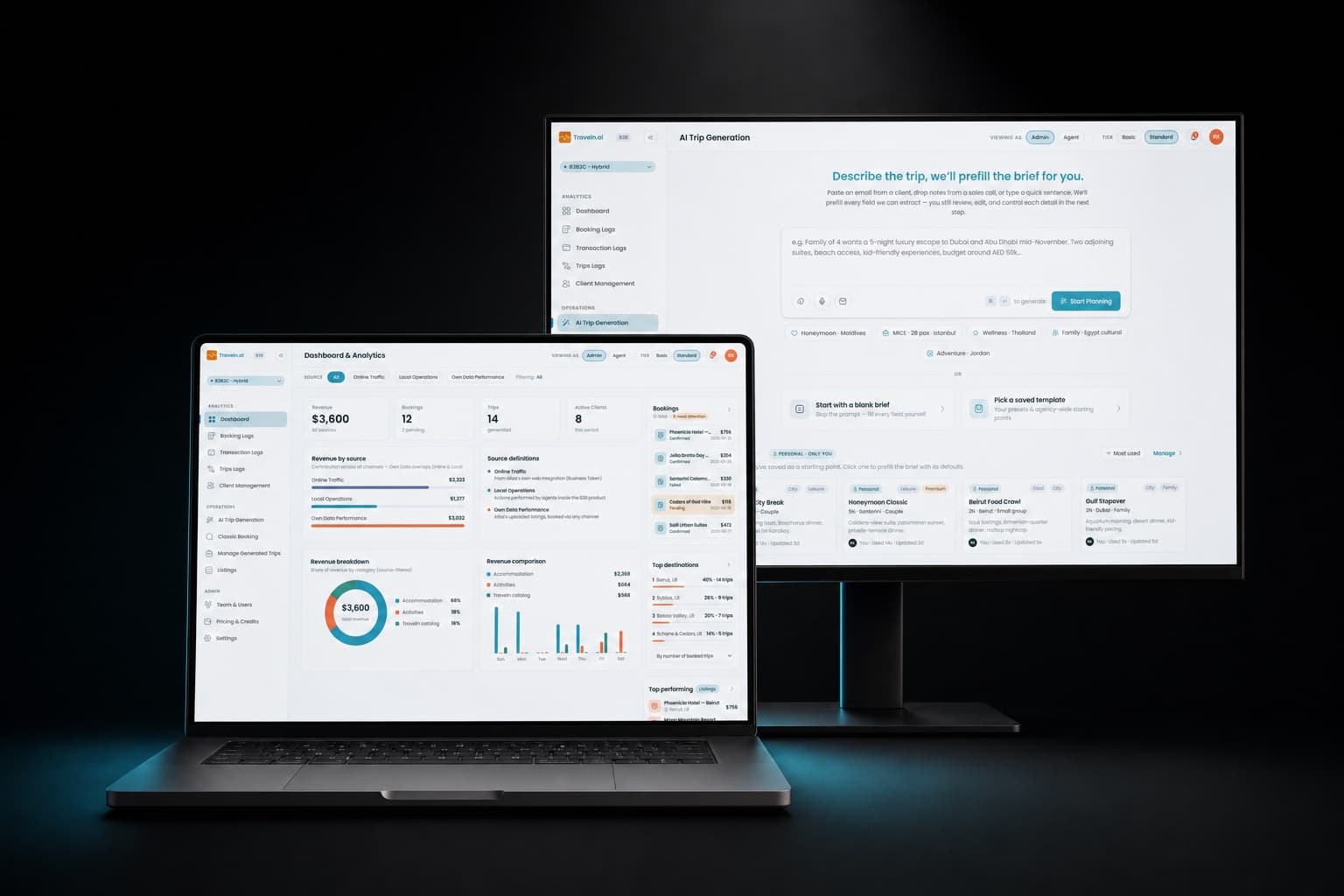
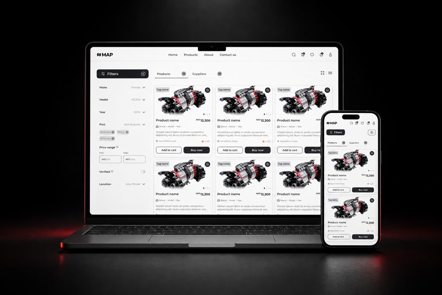
One system can serve more than one product. The MAP marketplace and its supplier dashboard share one design system, designed in eight weeks, so both sides of the business look and behave the same way. When we also build the front end, through our full-stack development work, the code components come from the same source.
How do you maintain a design system over time?
Maintain it by giving it a named owner, releasing it with version numbers, and having clear rules for how new components get in and old ones get out. Without these, teams start making local copies and the system drifts.
- Ownership: one person or small team decides what goes in and reviews changes. Owners do not have to build everything, but they have to approve it.
- Versioning: release changes with version numbers and a changelog, and mark changes that break existing screens.
- Contribution: a product team that needs something new proposes it, shows where it is used, and builds it to the system's standards before it is added.
- Deprecation: mark a component as deprecated, name its replacement, give a date, and remove it only after the screens using it have moved.
What does a design system for AI interfaces need?
A design system for an AI product needs components and rules for content the team does not write, because a model decides what appears on screen at runtime. This is what we call a dynamic design system. It adds three things to a standard system:
- Components a model can use: a defined set of blocks, such as a result card, a comparison table or a map pin, with clear inputs, so the model fills components instead of producing free layout.
- States for model output: loading, streaming while text arrives, uncertain when the model has low confidence or missing data, and failed, each with its own design and wording.
- Rules for what the model can and cannot show: which components it may use in which context, limits on length and number of items, and what always needs a person's confirmation before an action runs.
How do you build a design system for English and Arabic?
Build one direction-aware component library using logical properties, meaning start and end instead of left and right, so every component works in both directions without a second copy. In CSS this means margin-inline-start instead of margin-left, and the same idea applies to padding, borders, alignment and positioning in Figma and code.
Icons that show direction, such as back arrows and chevrons, flip in right-to-left; icons that do not, such as search or play, stay as they are. Type tokens need an Arabic typeface with its own sizes and line heights. We use this approach on Ejjati and on the Arabic version of the Traveln B2B dashboard: English and Arabic from one library.